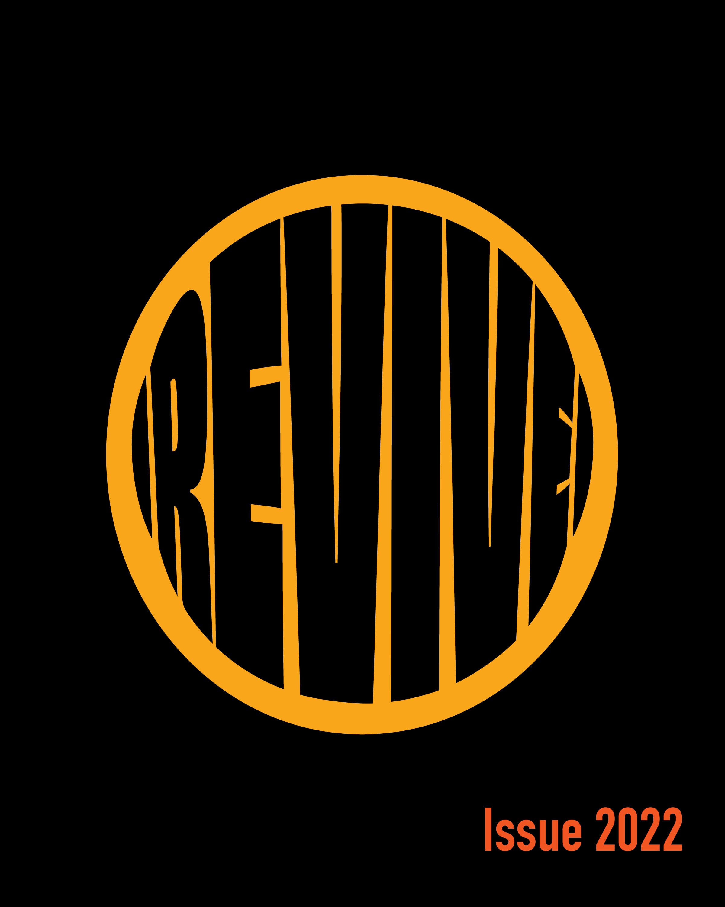
REVIVE Sustainability Quarterly
A publication focusing on the sustainable practices of preserving biodiversity. Utilizes bold typography and bright/contrasting colors to command attention and highlight the urgency of this issue.
Concept Designer • Editorial Designer • Photographer
Contents
Revive Magazine was created with the intent of educating and advocating for the preservation of endangered species. The magazine focuses on positive efforts that have been made to increase the population of a range of different species. Without these individuals and their amazing efforts many animals as we know it would cease to exist on planet Earth.
The magazine contains 3 self-curated editorials on the efforts to preserve monarch butterflies, Asian tigers, and red pandas. As well as a self-conducted interview with Kate Mason, an Environmental Science major at Northeastern University.
Background
Endangered species is a topic that needs to be advocated for. With my design, I wanted to emulate this urgency through my use of color and typography. I experimented with typography creating unconventional layouts while also utilizing big bold type across many of the spreads. In addition, the color scheme I utilized including black, off-white, orange, and yellow not only is a reference to the animals mentioned in the publication but are naturally eye-catching colors that have a lot of bold contrast between them.
The sketches below were some of my initial layout designs for my spreads. Although much of what is shown in these sketches was never utilized in the final design, as you can see bold type was something I knew from the beginning was going to help push my message and bring interest to my publication. These sketches show some of my initial experimentation and finding interesting ways to play with type and additional visual elements.


